7 Biggest Mistakes Therapists Make When They Design Their Own Website
"Your website is often the very first impression a potential client has of you — and in therapy, first impressions carry enormous weight."
Building your own therapy website seems straightforward until you realize that what feels right to you as a clinician is often the opposite of what works for someone searching for help in a moment of vulnerability. Here are the seven most common — and costly — mistakes sole practitioner therapists make when they go it alone.
01
Writing for Colleagues Instead of Clients
Therapists spend years immersed in clinical language — attachment theory, somatic experiencing, evidence-based modalities — and it's only natural that this vocabulary finds its way onto the page. The problem? Your potential client isn't another clinician. They're a person in pain who stumbled onto your website at 11 PM searching for relief.
When a website leads with "I utilize an integrative approach drawing from psychodynamic, CBT, and DBT frameworks," the average visitor's eyes glaze over before they even reach the contact form. They're not evaluating your theoretical orientation. They're asking: Can this person help me feel less alone?
The fix is writing in plain, warm, human language that describes what it actually feels like to work with you — and what life might look like on the other side of therapy.
Quick Fix
Read your homepage out loud. If it sounds like a journal abstract, it's time to rewrite it in the language your clients actually use when they describe their pain to you in session.
02Burying the Contact Information
This is one of the most common and most damaging website mistakes in private practice. A potential client, already anxious about reaching out, lands on your site and feels drawn in — then can't easily figure out how to get in touch. They leave. They don't come back.
Many therapists hide their contact page behind multiple clicks, bury a phone number in small print at the footer, or use a contact form so lengthy it feels like applying for a mortgage. Every barrier you add between a person and a conversation with you is a client you won't get to help.
Your contact information — or at minimum, a prominent link to schedule — should appear above the fold on your homepage and be repeated at the bottom of every single page.
Quick Fix
Add a persistent "Schedule a Free Consultation" button to your navigation bar. Make it stand out with a contrasting color. Then test your own site on a phone as if you were a nervous first-time visitor.
03Using a Generic Stock Photo as the Hero Image
There is a stock photo that appears on approximately half of all therapy websites: two people sitting across from each other in beige armchairs, one of them nodding, the other looking pensively into the distance. You've seen it. Your potential clients have seen it. It says nothing about you.
The therapeutic relationship is fundamentally personal. Clients are choosing a person, not a service. When your website features the same imagery as every other therapist in your zip code, you are invisible. Worse, heavily staged stock photos can actually undermine trust — they create a subconscious sense that what's being presented isn't quite real.
A genuine photo of you — even one taken with a decent smartphone in natural light — will outperform polished stock photography almost every time because it answers the question every visitor is silently asking: Who am I actually going to be sitting across from?
Quick Fix
Invest a few hundred dollars in a professional headshot session or ask a trusted friend with a good camera to photograph you in a comfortable, natural setting. Warm lighting, a genuine expression, and a real background beat studio perfection.
04Neglecting Search Engine Optimization (SEO) Entirely
Many therapists assume that once a website is published, people will simply find it. In reality, a beautiful website that isn't optimized for search engines is a billboard in a windowless room. If Google doesn't know who you serve, where you're located, or what specialties you offer, it won't show your site to the people looking for exactly what you provide.
The most critical piece of local SEO — and the one most often overlooked — is specificity. "Therapist in Austin" is a starting point; "therapist for new parents in South Austin" is a niche with real search intent and far less competition. Solo practitioners who niche down in their copy tend to rank faster and attract better-fit clients.
At a minimum, your page titles, headers, and meta descriptions should include your specialty, your city, and the population you serve. A Google Business Profile, properly filled out, is also non-negotiable.
Quick Fix
Search Google for the exact phrase you'd want a potential client to type. See who ranks. Then look at their page titles and headers — that's your SEO competition map. Build your page structure around the specific terms real people are actually searching.
05Treating the "About" Page as a Résumé
The About page is typically the second most-visited page on a therapist's website, right after the homepage. It is also the page where most therapists make a critical error: they write a professional biography when what a potential client actually wants is a sense of who you are as a human being.
A list of credentials, degrees, certifications, and training programs may feel reassuring to write. But to someone scrolling at midnight wondering if they can trust a stranger with their inner world, it reads as cold and distant. Credentials matter — but they belong lower on the page, after you've already established a human connection.
The most effective About pages open with something true and personal: why you became a therapist, what you genuinely care about, or a brief glimpse into the approach you bring to the work. Credentials ground the credibility; humanity earns the click to "Contact."
Quick Fix
Start your About page with a single paragraph written in first person that has nothing to do with your credentials. Describe your "why." You can list your degrees after — they'll land better once a reader already feels connected to you.
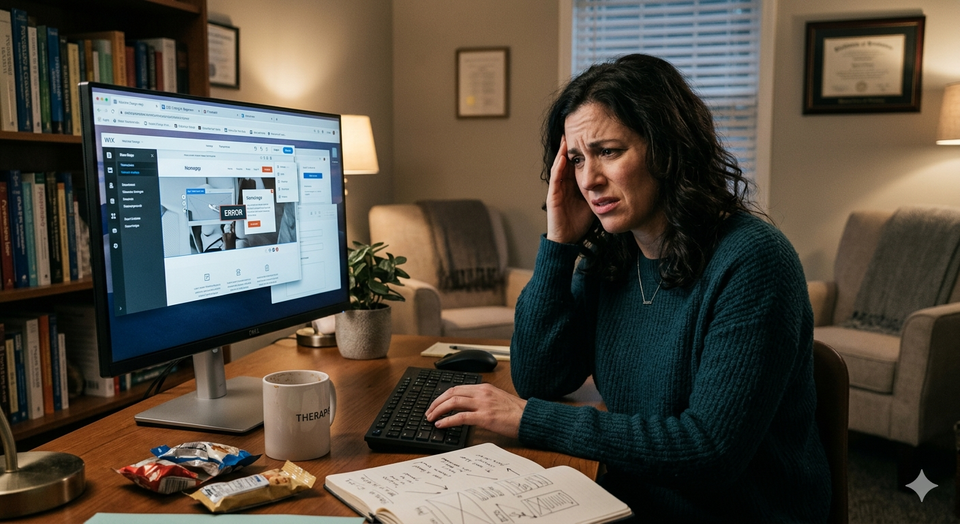
06Ignoring Mobile Responsiveness
More than 60% of web traffic now comes from mobile devices, and for mental health searches — which often happen in private, late at night, on a phone — that number is likely even higher. If your website was designed on a laptop and never tested on a phone, there is a strong chance it is alienating a majority of your visitors.
The symptoms are familiar: text that's too small to read without zooming, navigation menus that require pinching and squinting, contact forms that run off the side of the screen, and images that stack awkwardly. These aren't cosmetic annoyances — they communicate carelessness, and for someone in a vulnerable moment, carelessness is disqualifying.
Most modern website builders offer mobile preview modes, but many therapists never use them. A template that looks polished on a desktop can become a maze on a 6-inch screen if no adjustments are made.
Quick Fix
Pull up your website on your own phone right now and attempt to contact yourself. Navigate every page. If anything feels frustrating, it will feel worse to someone who doesn't know how it's supposed to work.
07Failing to Communicate Who You Help — and Who You Don't
Vague websites attract no one in particular. Specific websites attract the exact right people. Yet most sole practitioner therapists — often out of fear of "leaving anyone out" — write copy so broad it offers nothing to latch onto.
"I work with individuals, couples, families, and groups. I specialize in anxiety, depression, trauma, relationships, life transitions, and personal growth." This describes almost every therapist in practice. It gives a potential client no reason to choose you over anyone else, and no reason to feel understood before they've even reached out.
Counterintuitively, the more specific you are about who you serve and what you're especially good at, the more clients you will attract — not fewer. Someone who fits your niche perfectly reads your specific language and thinks: This therapist is describing exactly what I'm going through. That feeling of being seen before the first appointment is extraordinarily powerful.
It is also worth noting: a website that clearly communicates your specialty protects your time. Clients who aren't the right fit self-select out before they ever pick up the phone.
Quick Fix
Write a single sentence that begins: "I specialize in helping [specific population] who struggle with [specific challenge] so that they can [specific outcome]." Put that sentence — or something close to it — near the top of your homepage. Then build the rest of your copy around it.